
Connect Networking Event
Jan. 2023 – May. 2023
- Type
- Event Design
- Team members
- Ben Savitz, Nayoung Im, Jade McMichael, Khalani Miller, Kaity O'Hanlon
- Role
- Project Manager, Production Lead
- Tools
- Photoshop, Illustrator, InDesign
Introduction
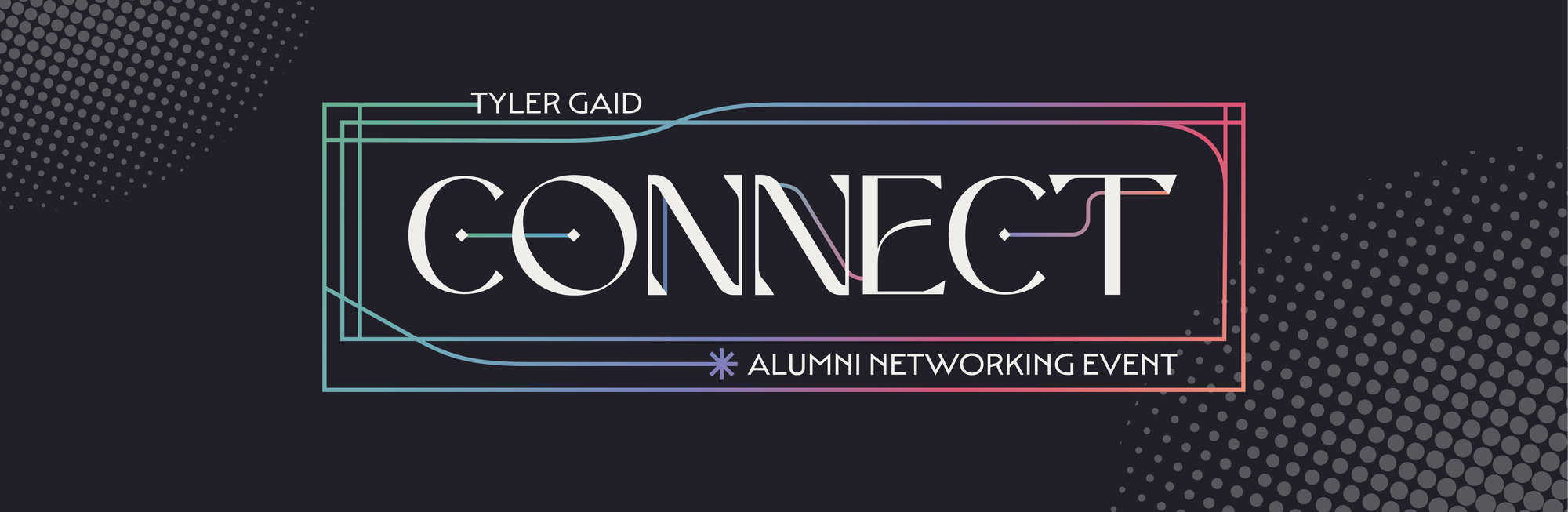
Connect is Tyler GAID's annual alumni and friends networking event. The identity is rebuilt from scratch every year by the program's Event Design class. For the 2023 edition, the concept came from the word itself: a single hairline threads through the CONNECT logotype, and that connecting line carries across the system as nested keyline frames over an iridescent gradient. The identity was developed collaboratively by a team of six, and I contributed to the typographic system alongside my teammates. My primary role was managing the project and leading production: as a technician in the school's print studio, I handled file formatting and prepress for every deliverable and oversaw in-house printing, cutting, and assembly of roughly 250 name tags and the event's printed collateral.
Project Motive
WORD STUDY AND SKETCHES
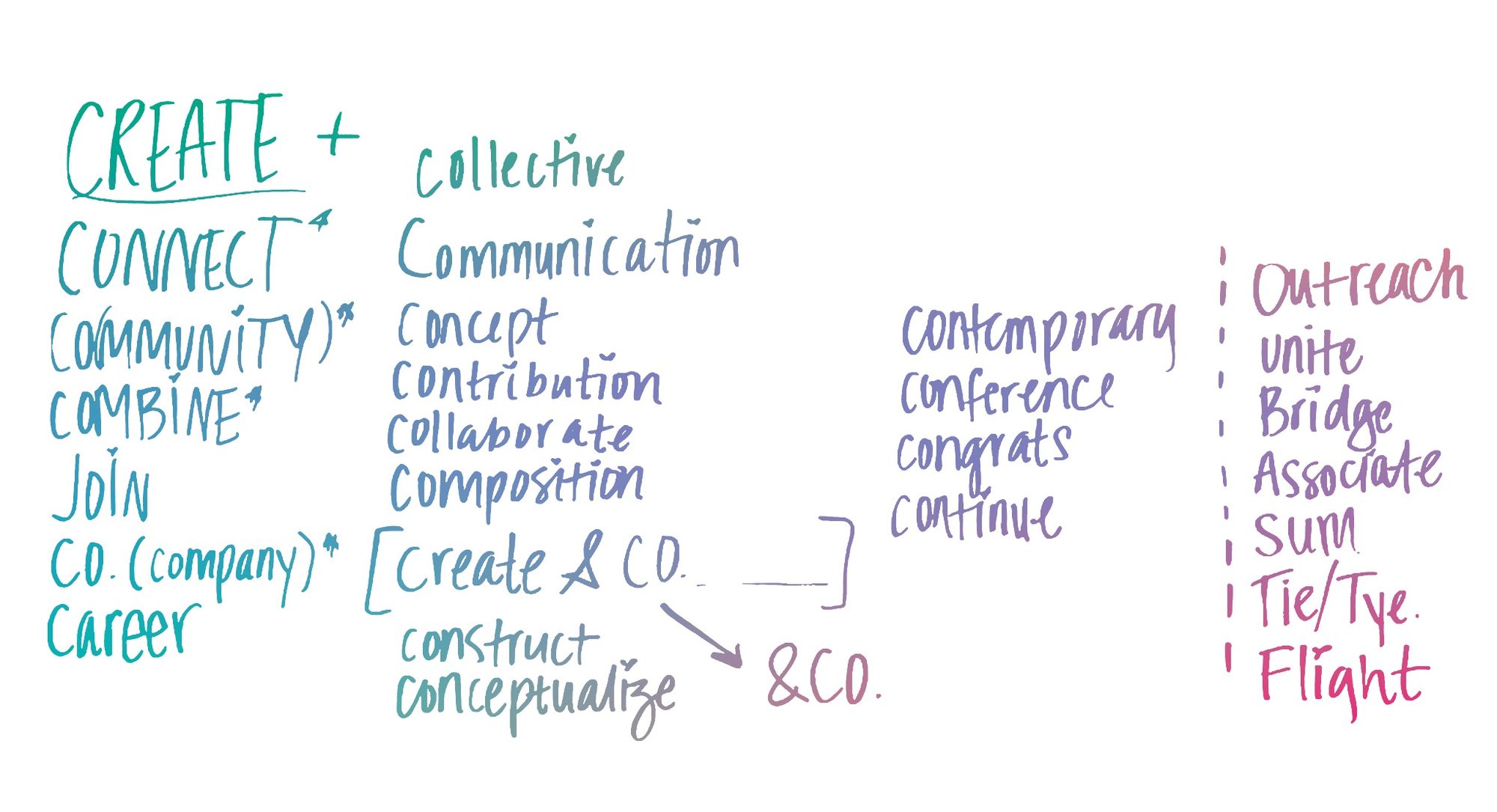
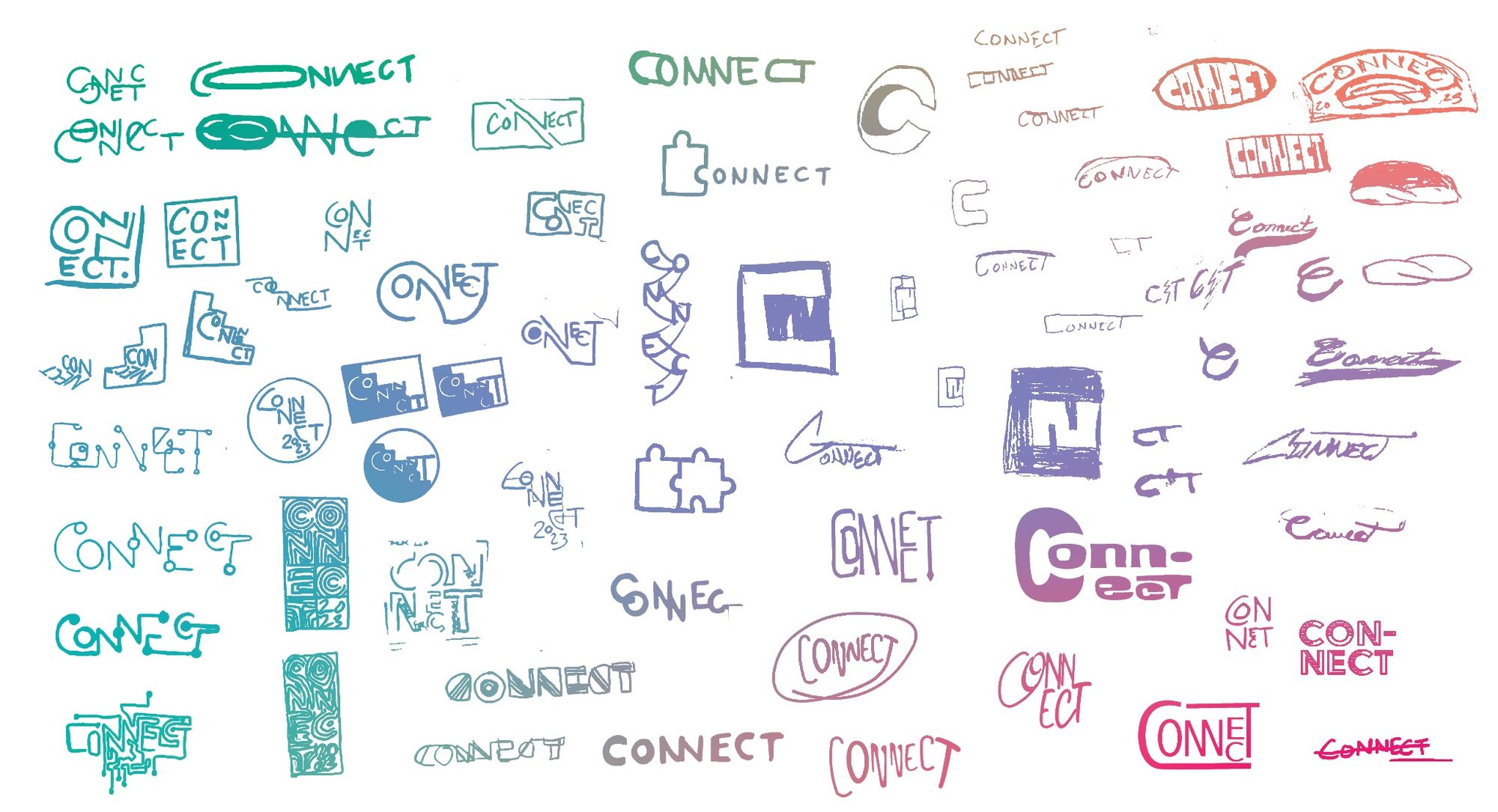
Every year the Event Design class inherits the same two event names, Create and Connect, and has to find a new reason for them to look the way they do. We started with the language. Writing out what the events actually do returned a list that came back almost entirely in one letter: collective, communication, collaborate, contribution, community, combine, continue, congrats. The prefix co- already means together, so the connection we were designing for was sitting inside the words themselves. That set the brief. Instead of illustrating networking through handshakes, bridges, or puzzle pieces, all of which we sketched and set aside, we looked for it in the letterforms. The sketching kept moving toward joining: letters sharing strokes, sitting inside shared frames, linked by a continuous line. The final logotype threads a single hairline through CONNECT, and the responsive mark holds a node inside the counter of the C.
Logo Design
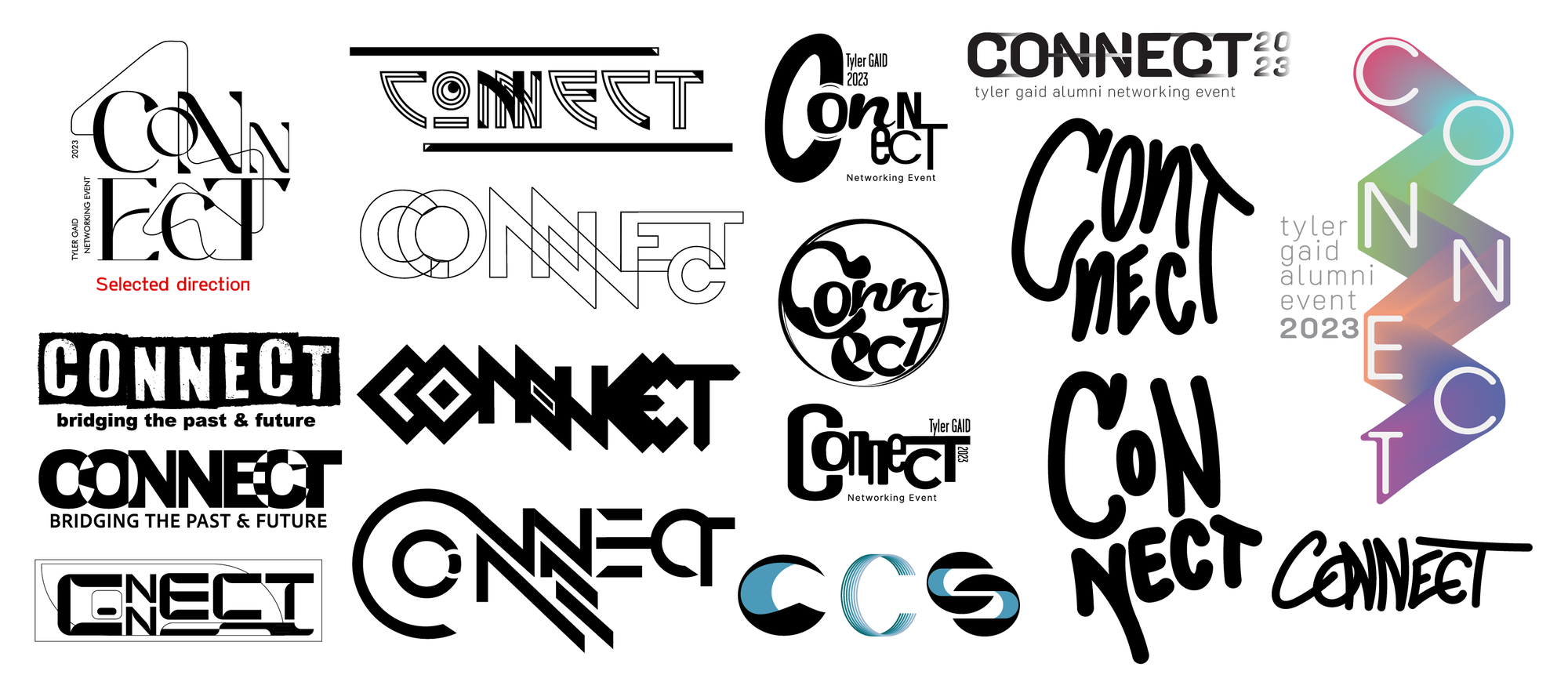
All six of us developed logo concepts independently for the first round, then brought them together onto a single board to review as a group. We moved forward with Kaity O'Hanlon's concept and developed it into the final logotype.
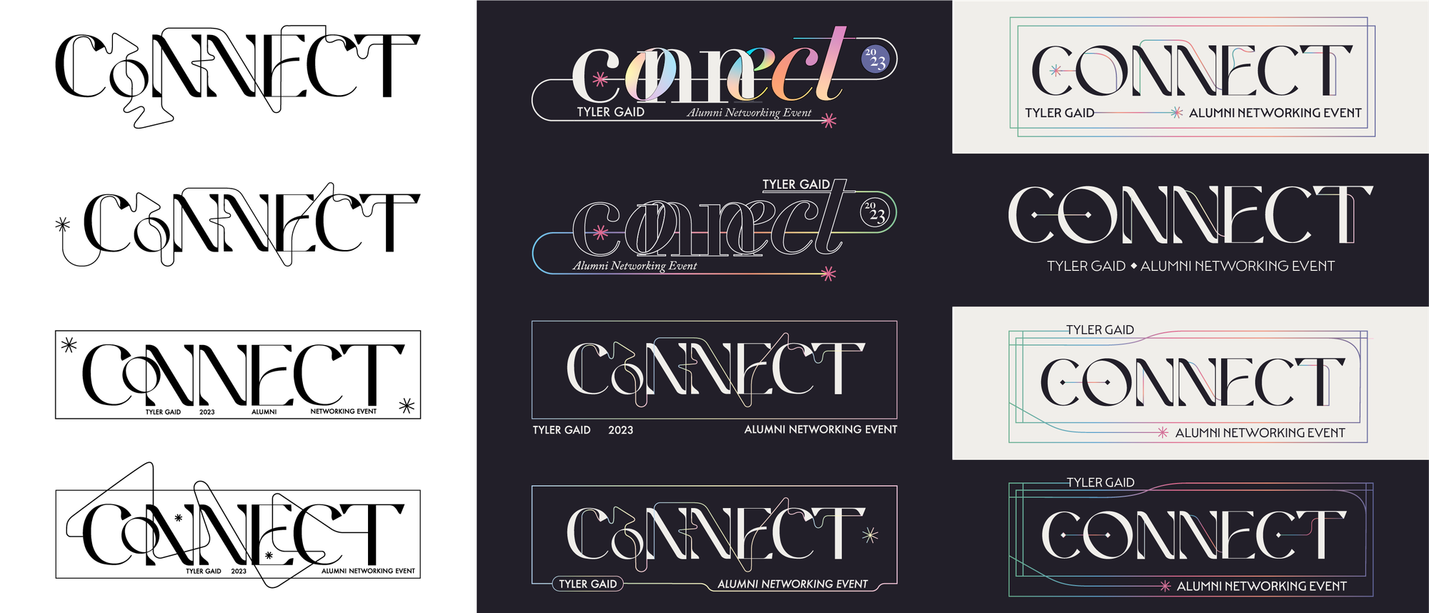
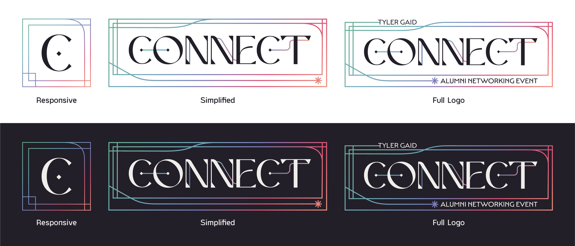
From the selected concept we tightened the letterforms and restructured the lockup, moving from a stacked two-line arrangement to a single horizontal logotype. The loose line weaving through the concept became a controlled hairline that passes between letters at a consistent weight, and a nested keyline frame was added to hold the wordmark and the event descriptors. We then drew a responsive C mark for small applications, and built light and dark versions of both.
Style Guide
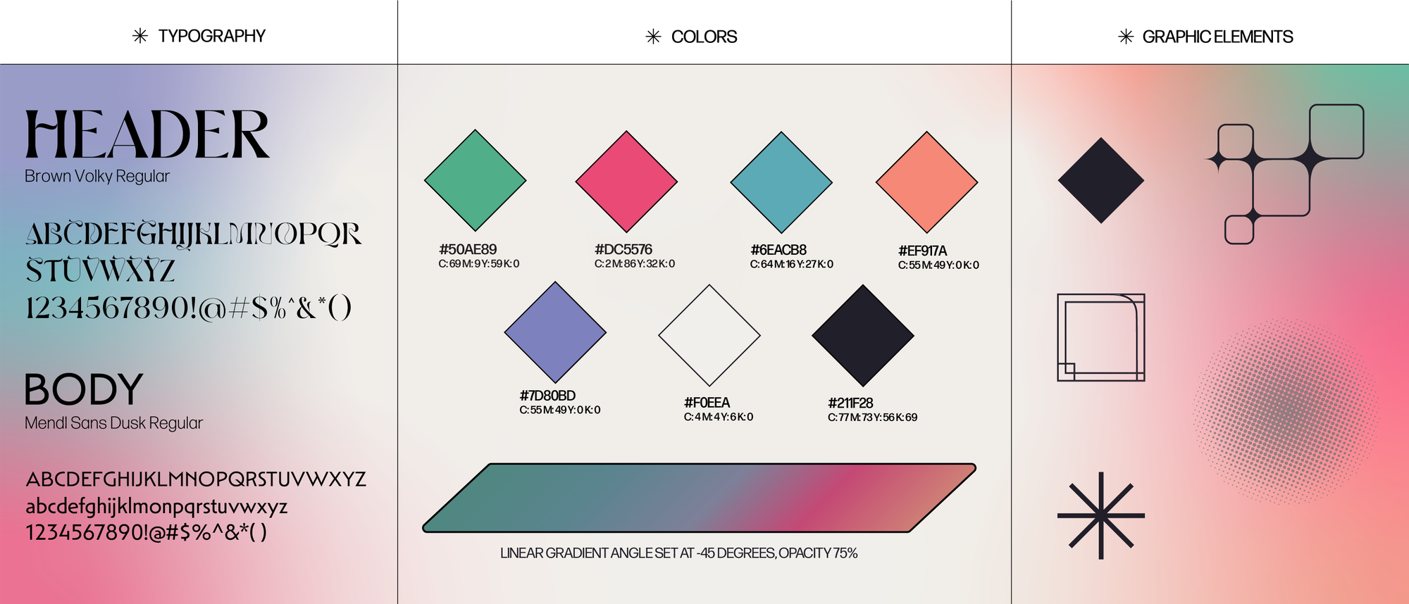
The system pairs Brown Volky Regular for display with Mendl Sans Dusk Regular for body copy. The deco capitals carry the connecting line and the diamond terminals from the logotype, while the geometric sans keeps event details, names, and dates plain enough to read on a badge at arm's length. Five brights carry the identity, with #F0EEA and #211F28 as the light and dark grounds. Rather than assign each color a fixed role, we ran all five as a single linear gradient set at -45 degrees at 75 percent opacity, so each piece pulls a different section of the spectrum and the collateral reads as one run rather than a set of variants. The graphic elements extend the logotype's line work: a rounded connector path, keyline frames, a diamond, an asterisk, and a halftone screen used for texture and photo treatment.
Applications
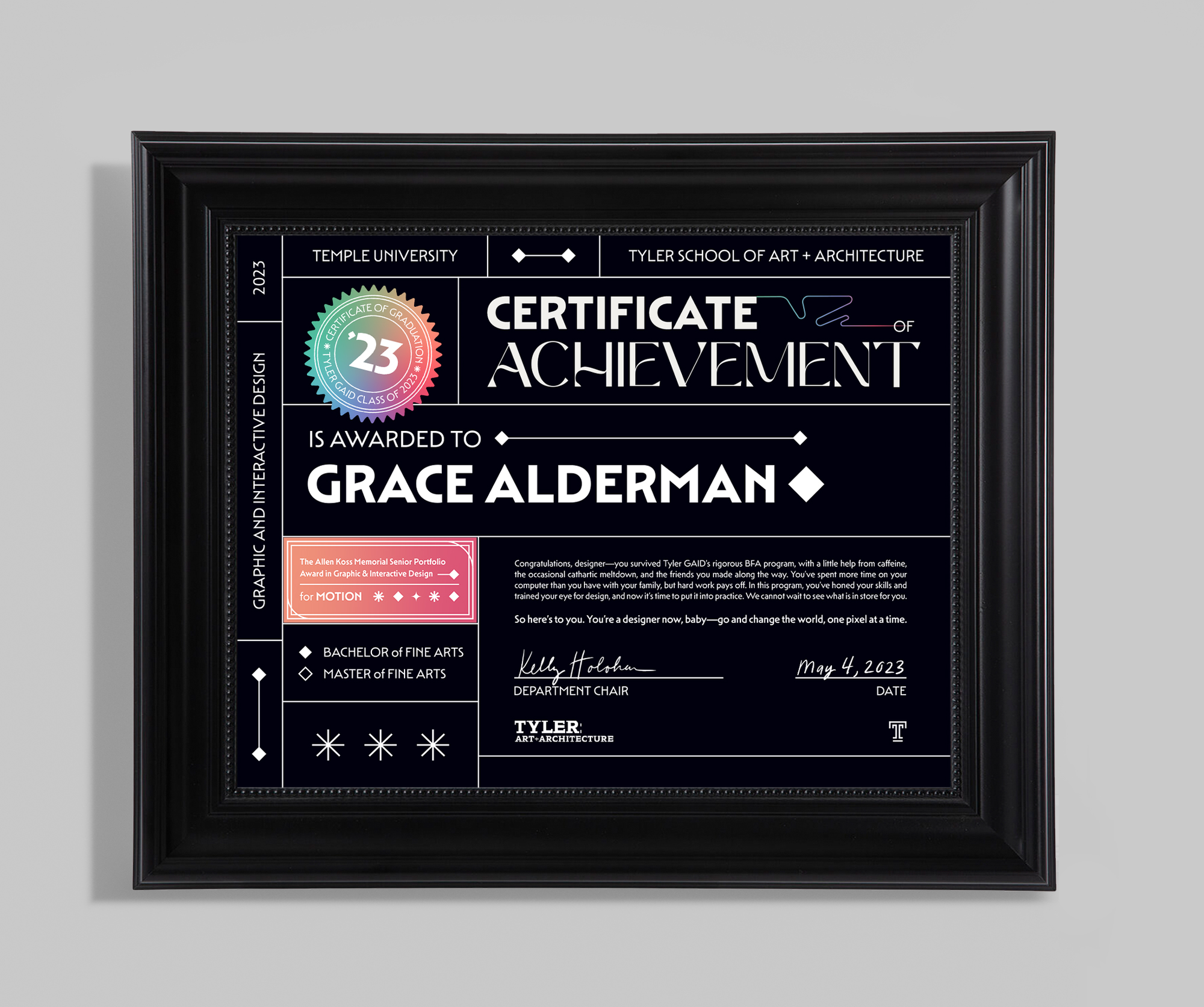
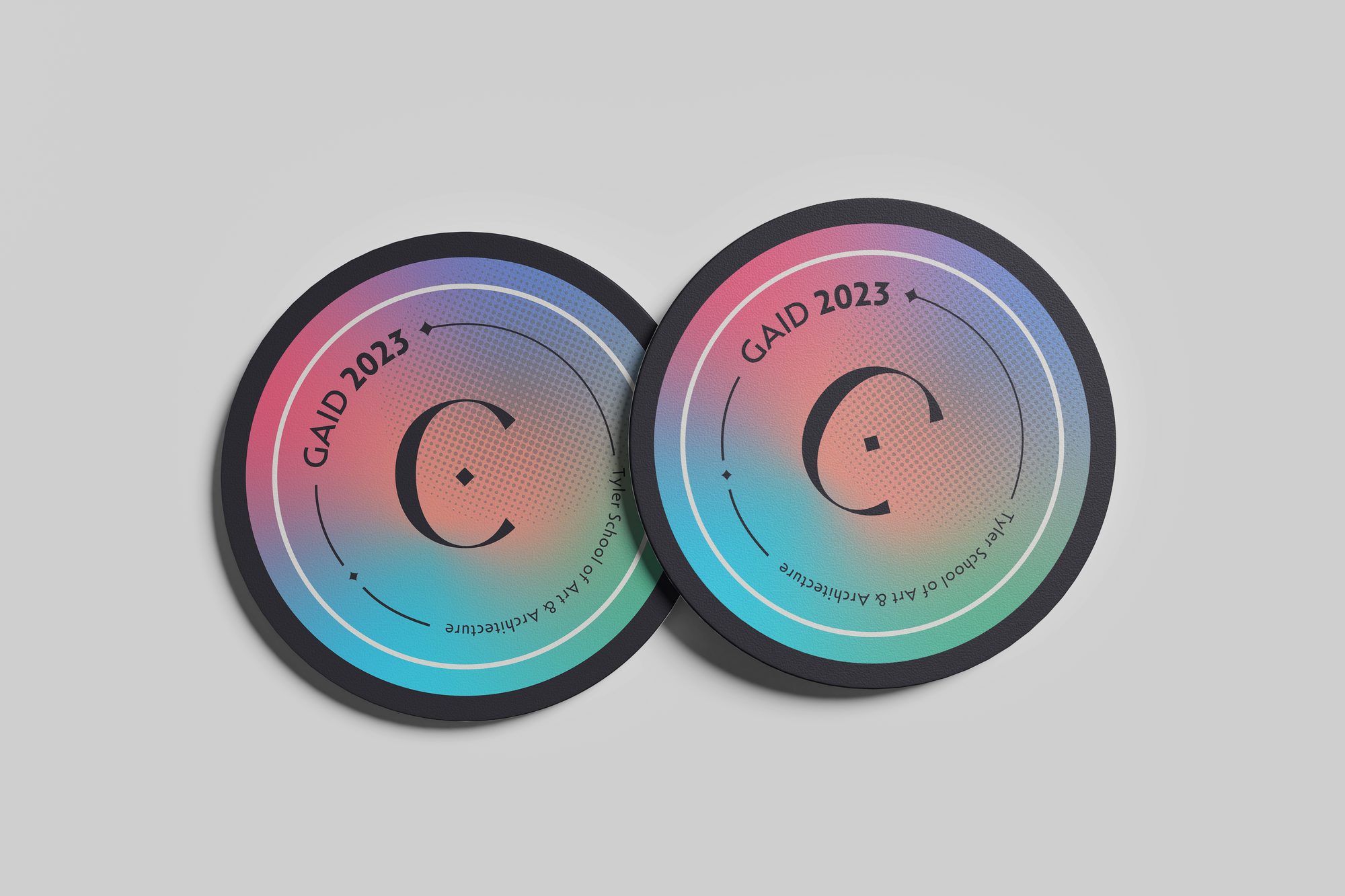
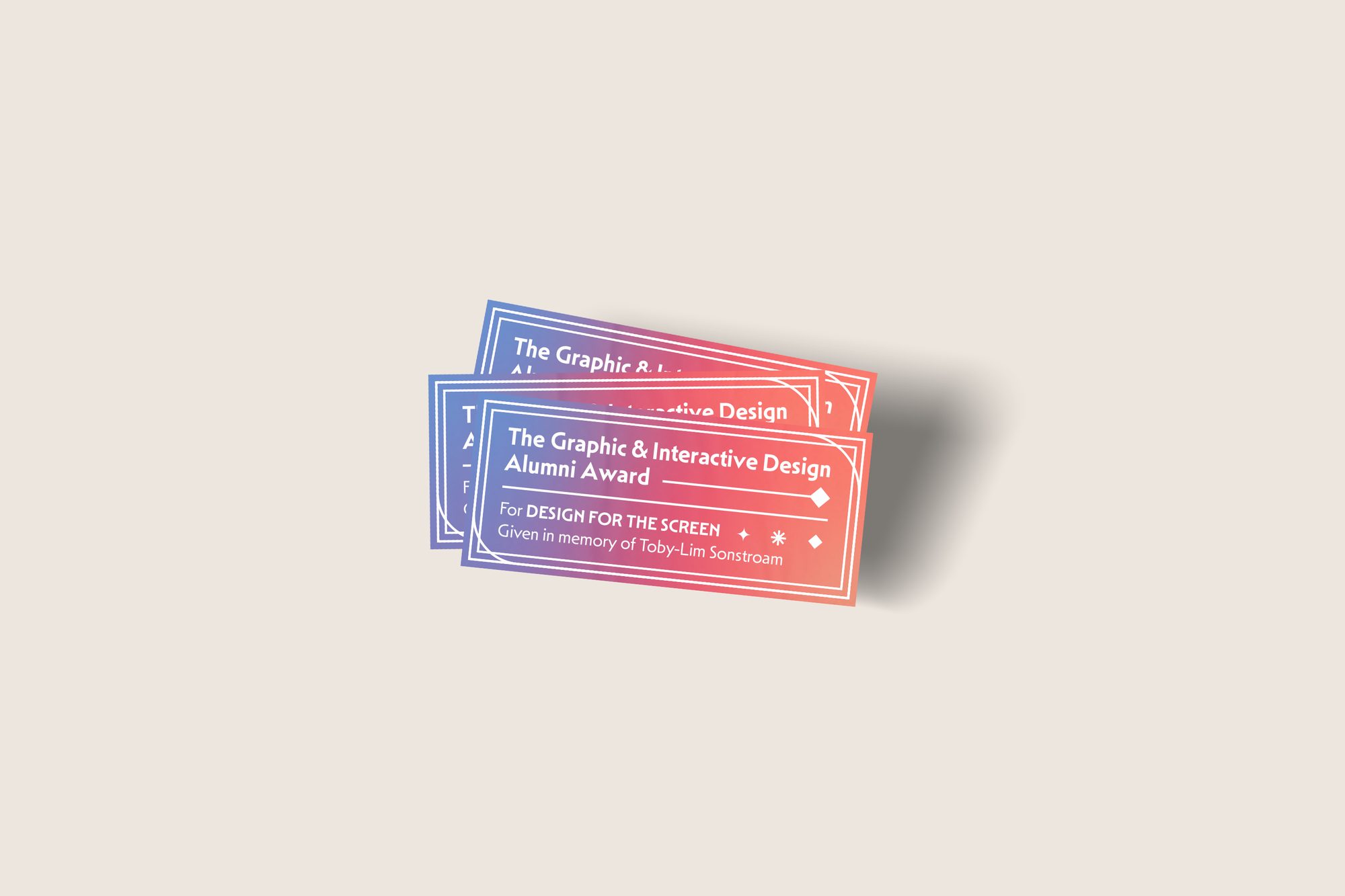
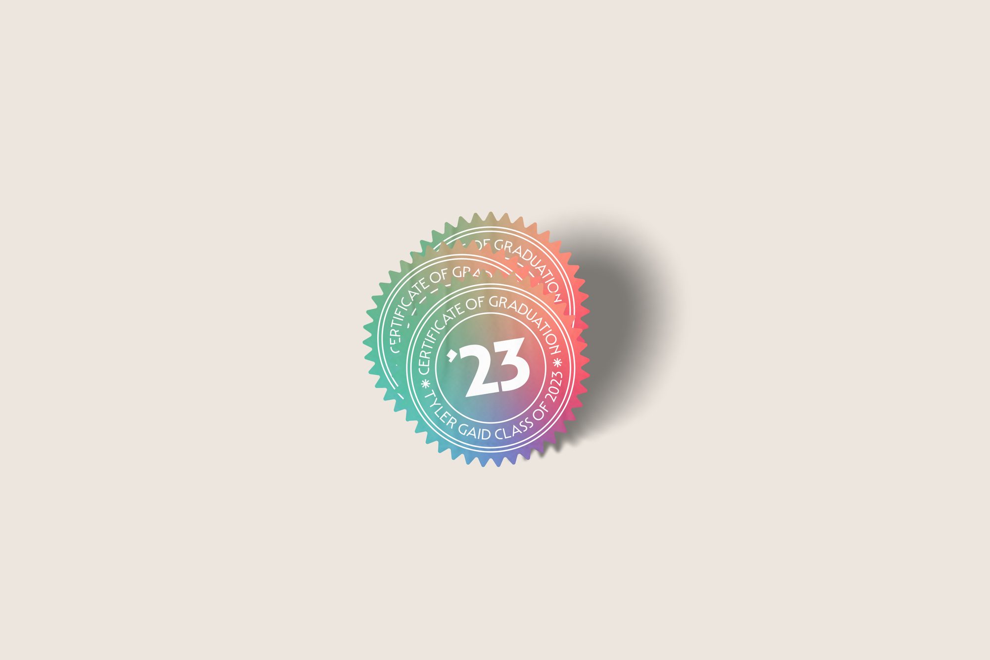
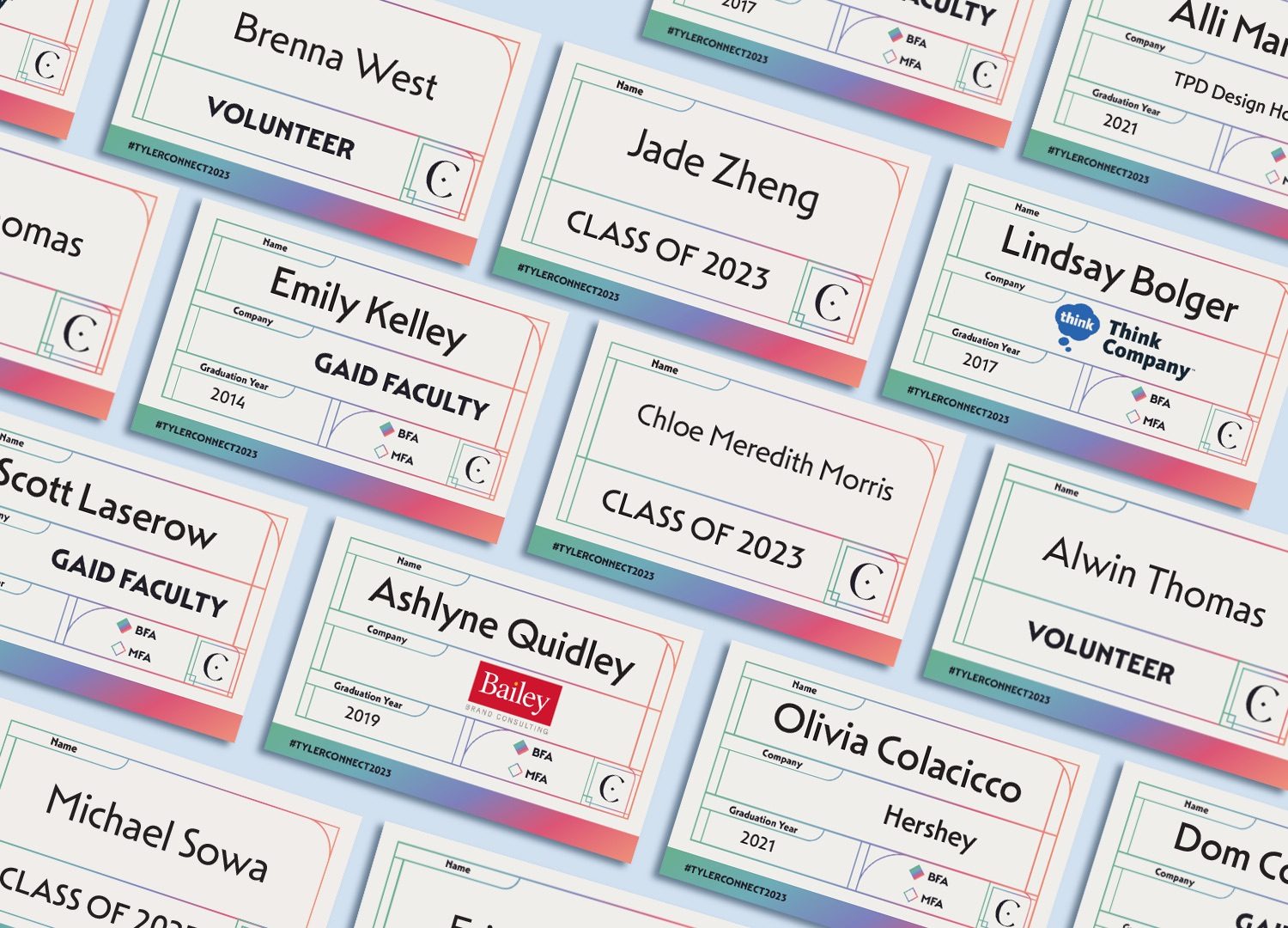
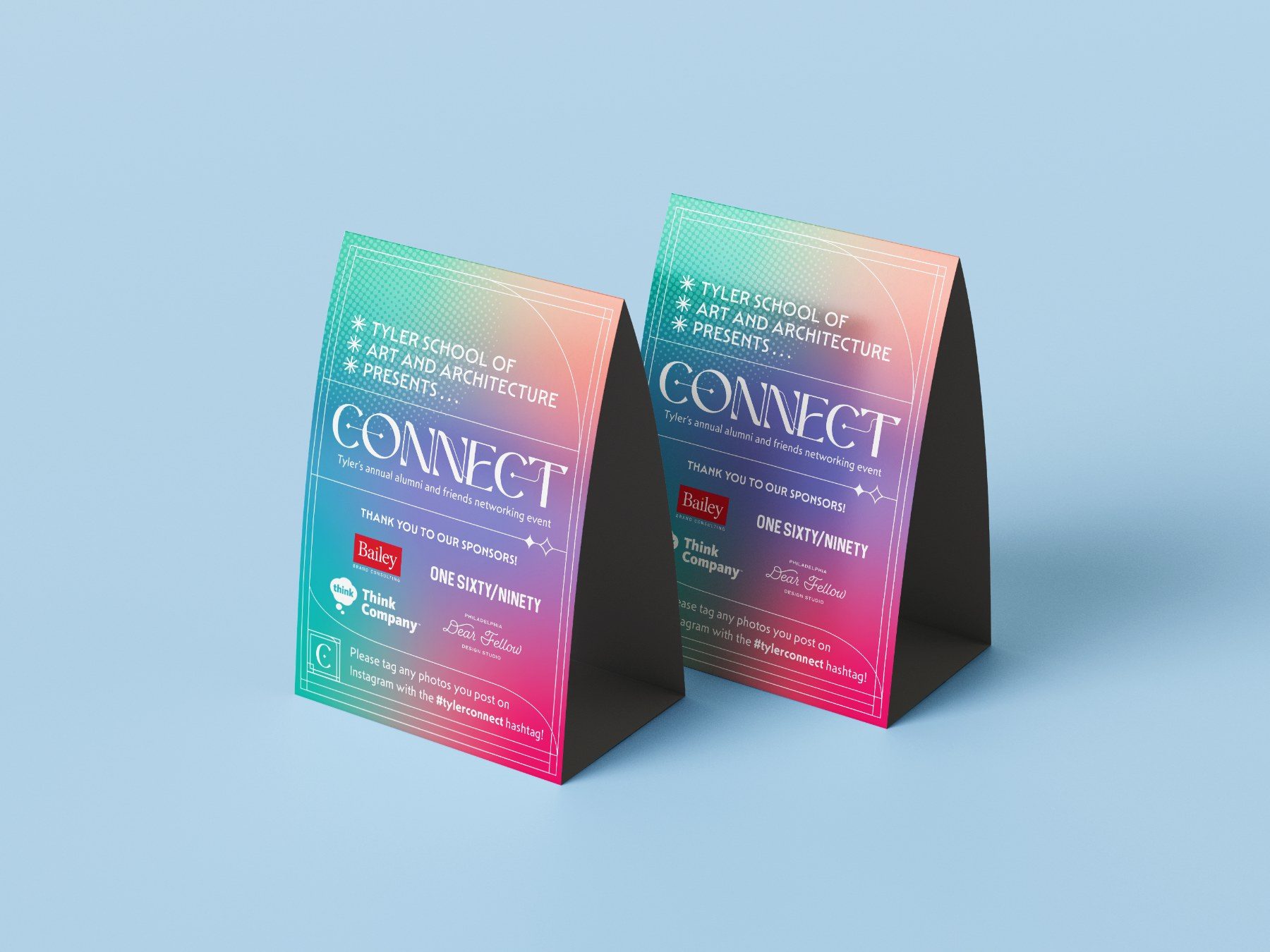
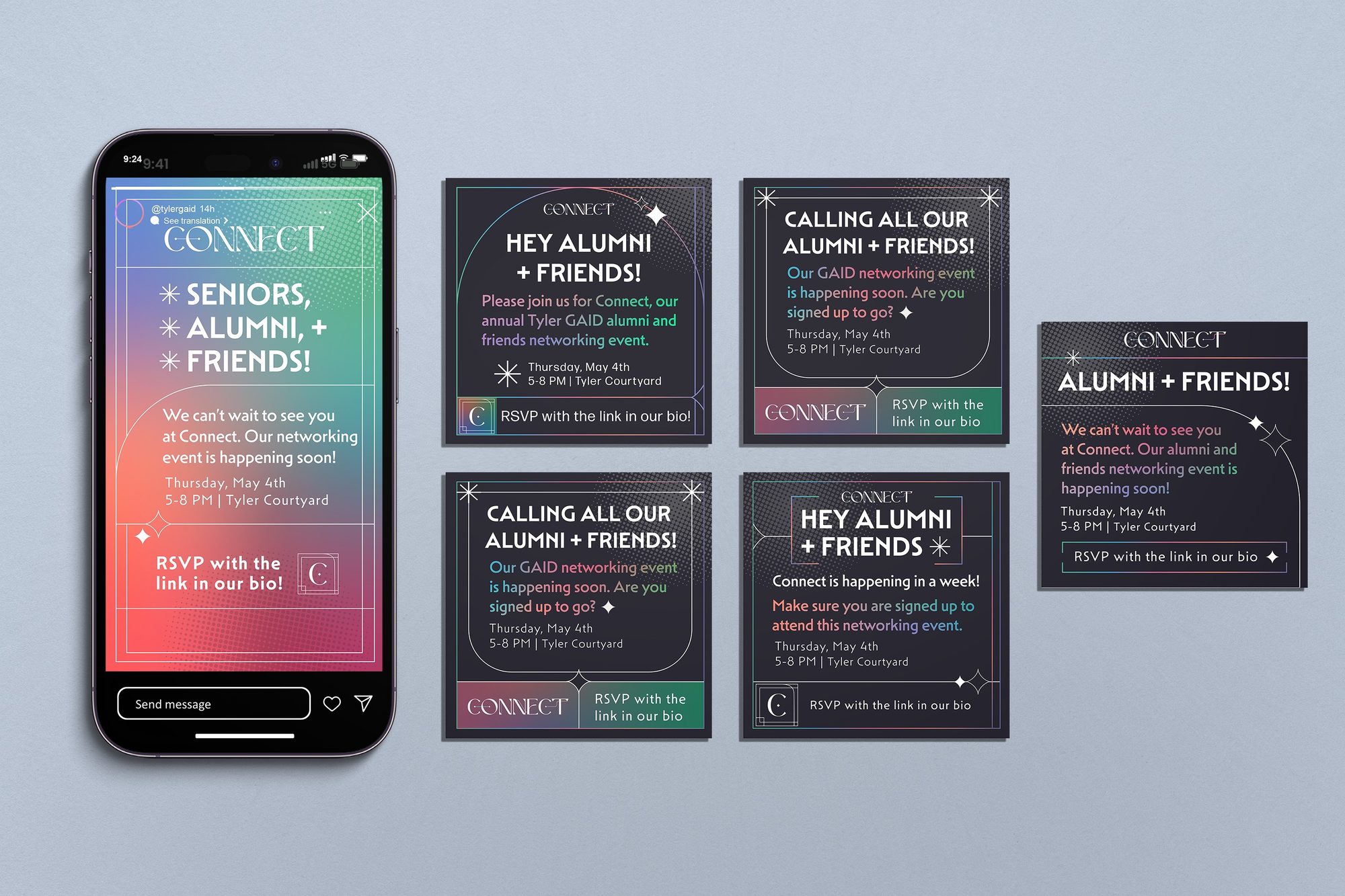
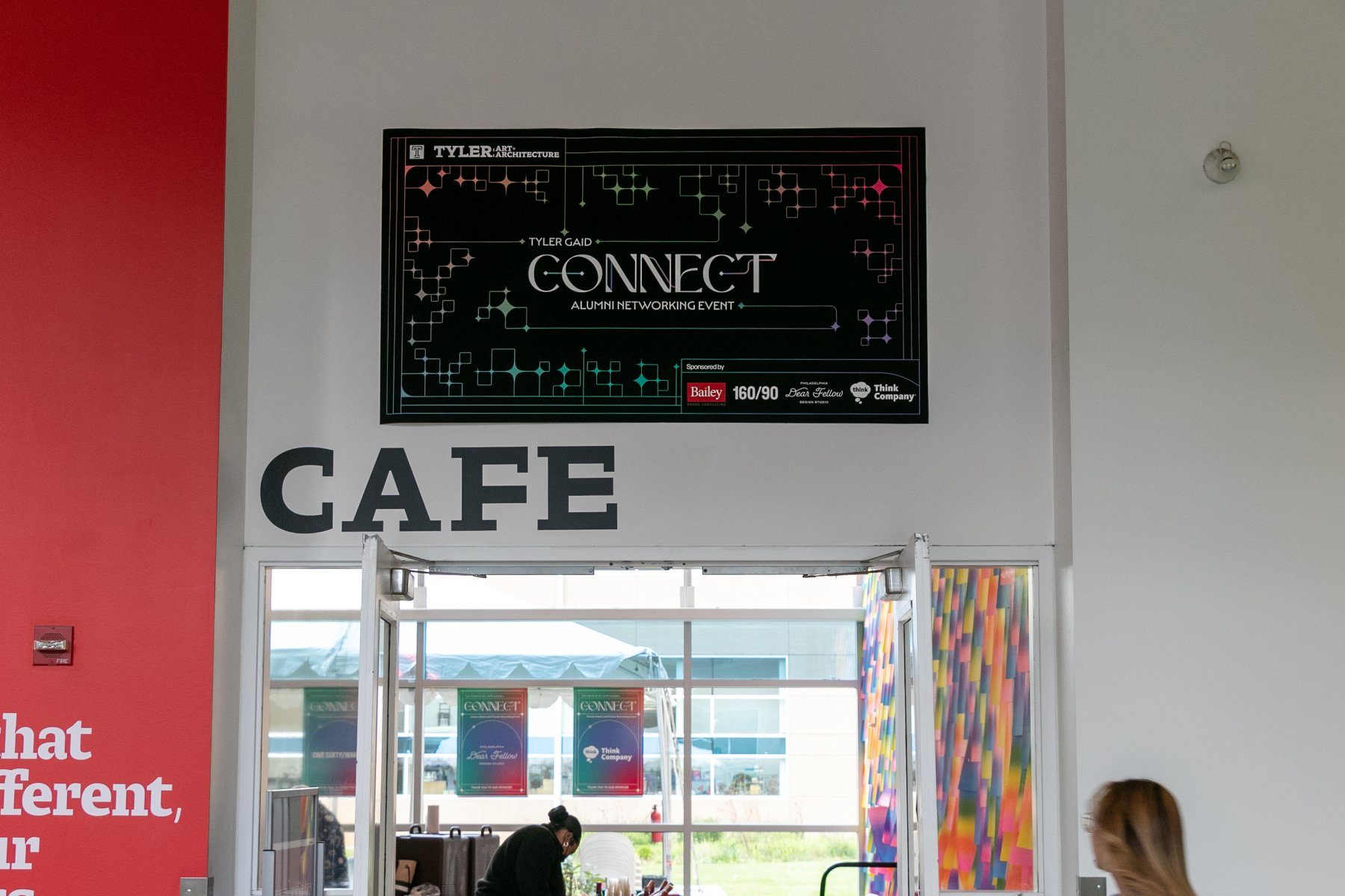
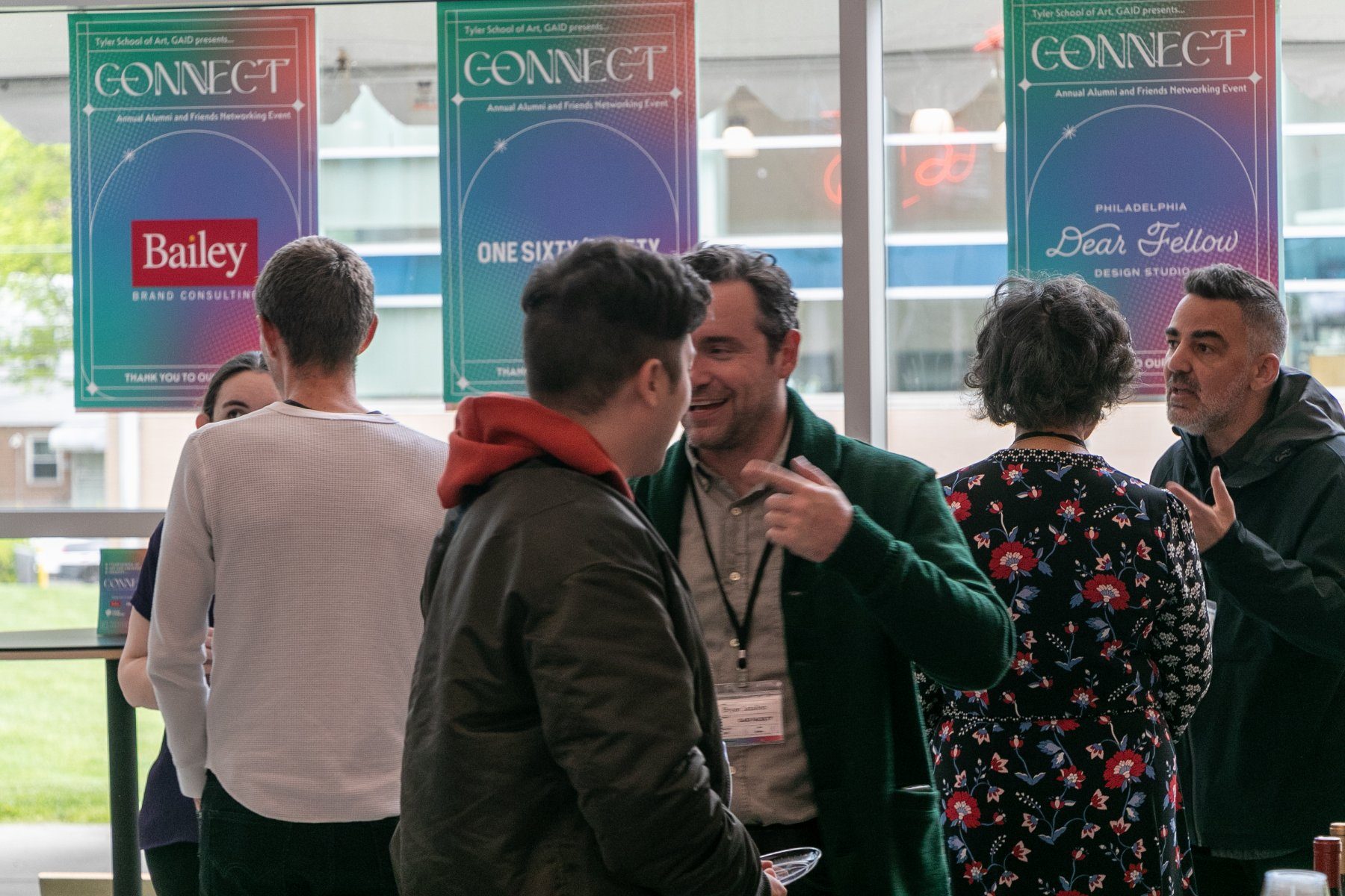
The system had to hold across screens, across a courtyard, and in a guest's hand. It runs from Instagram stories to signage, and across stock ranging from paper to sticker vinyl to coaster board, with each piece pulling a different segment of the gradient so nothing repeats while everything stays in family.
Production
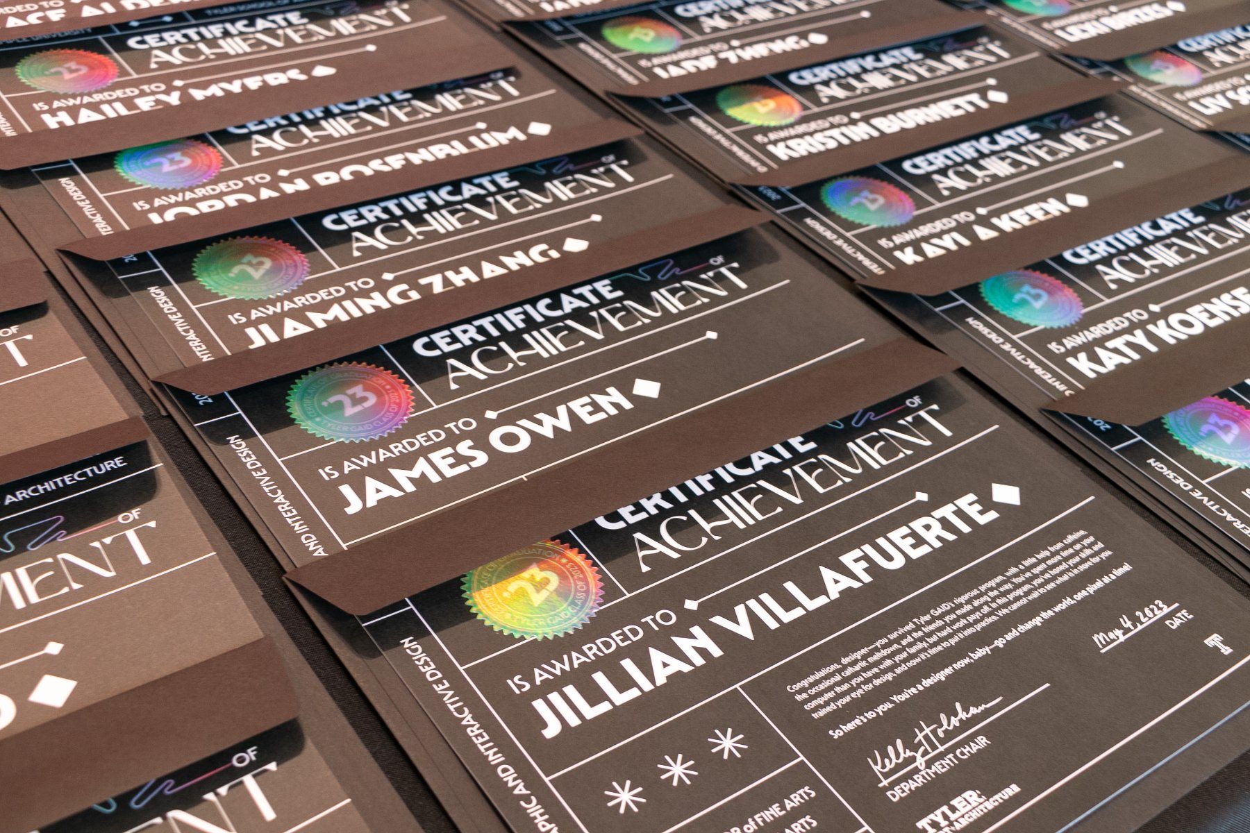
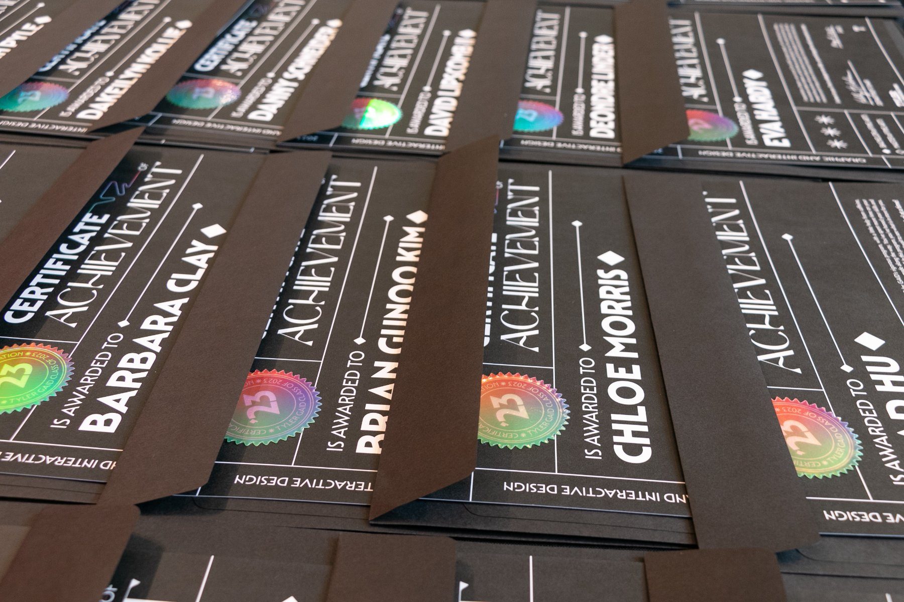
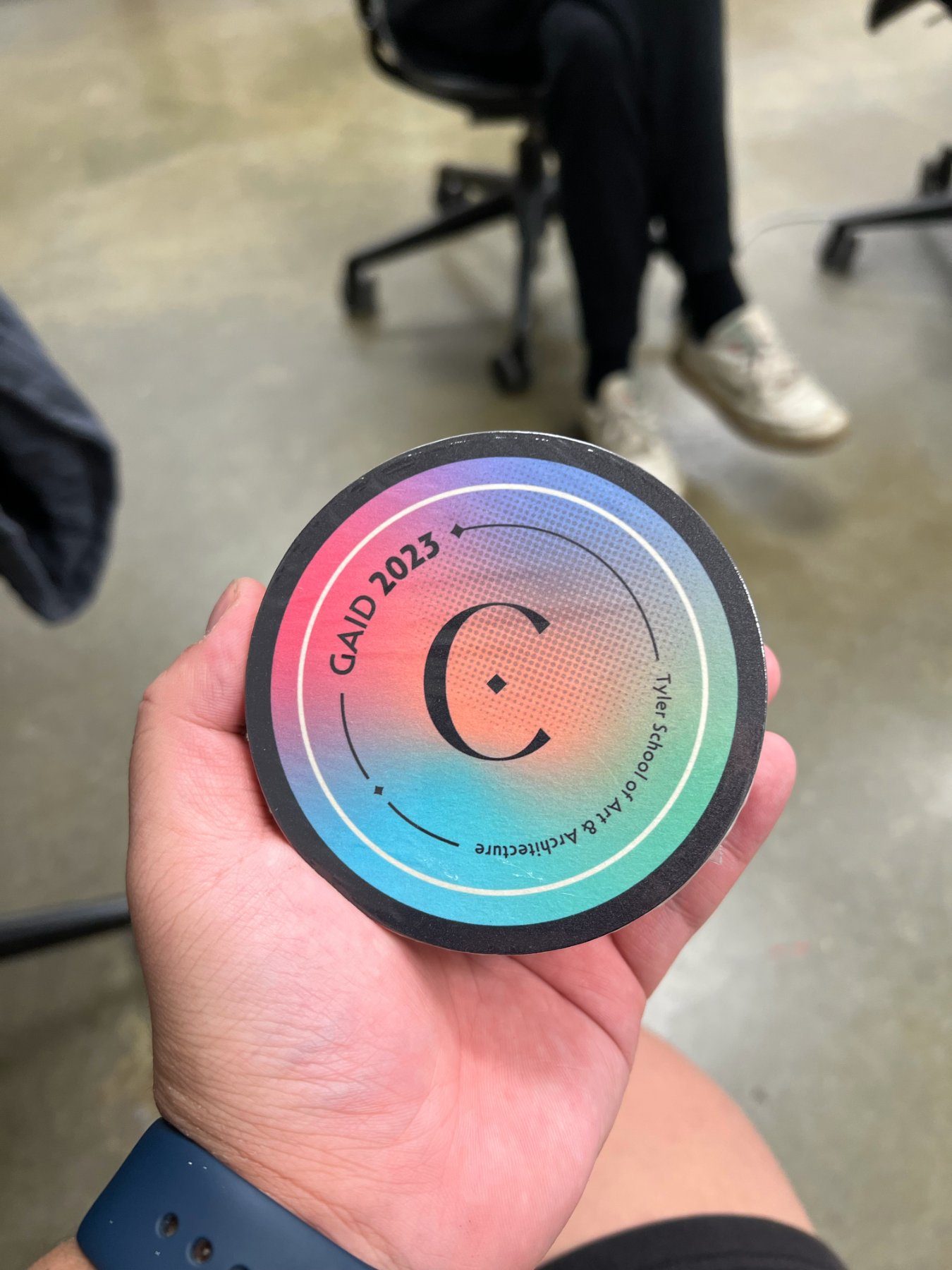
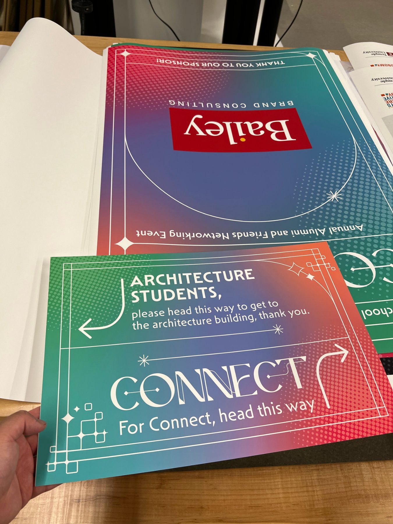
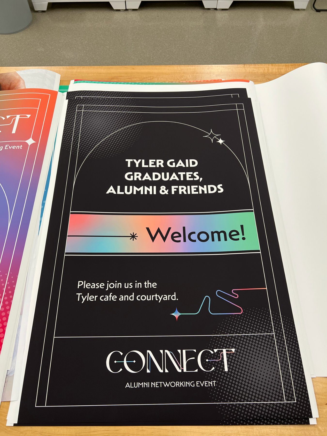
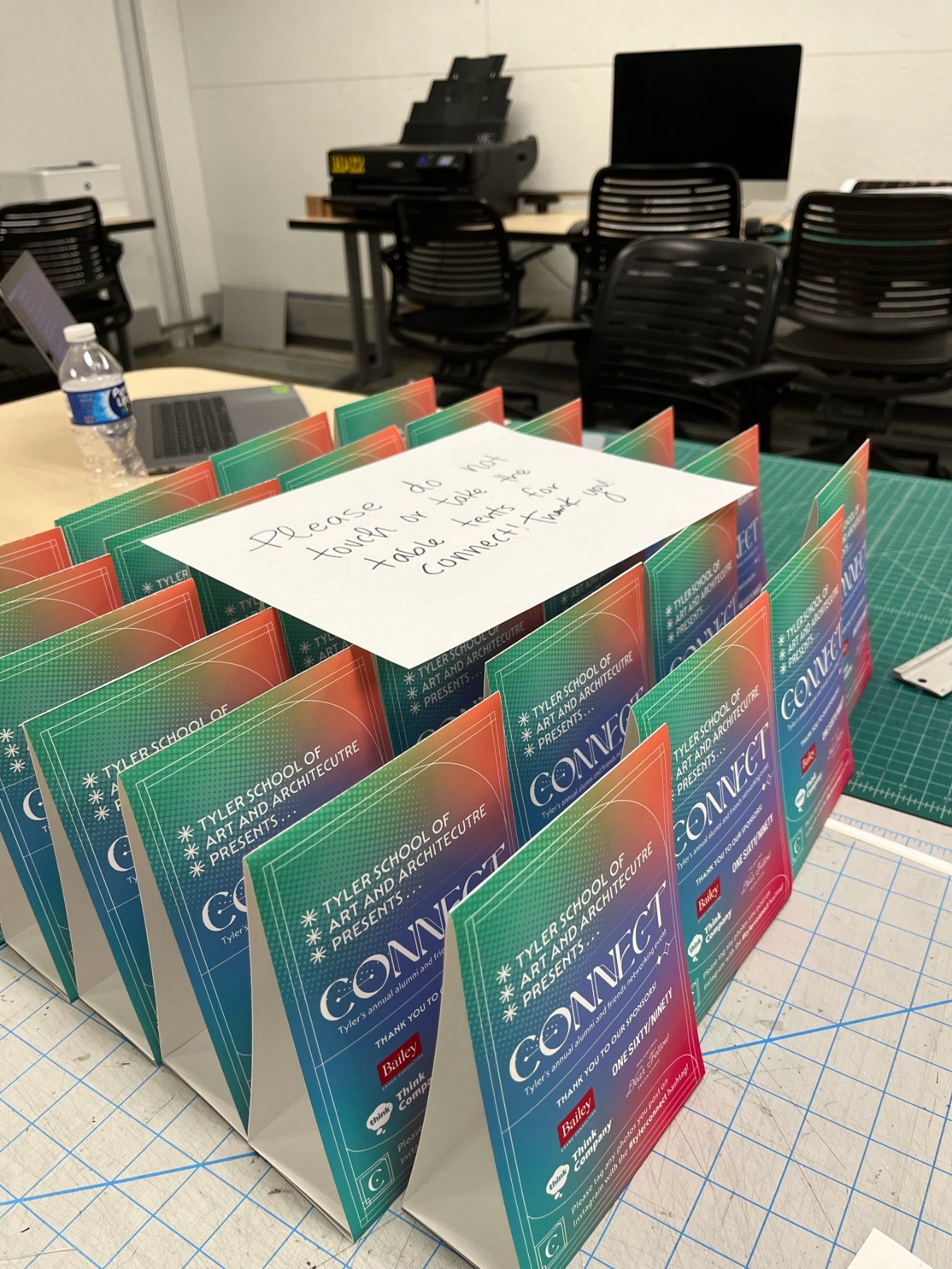
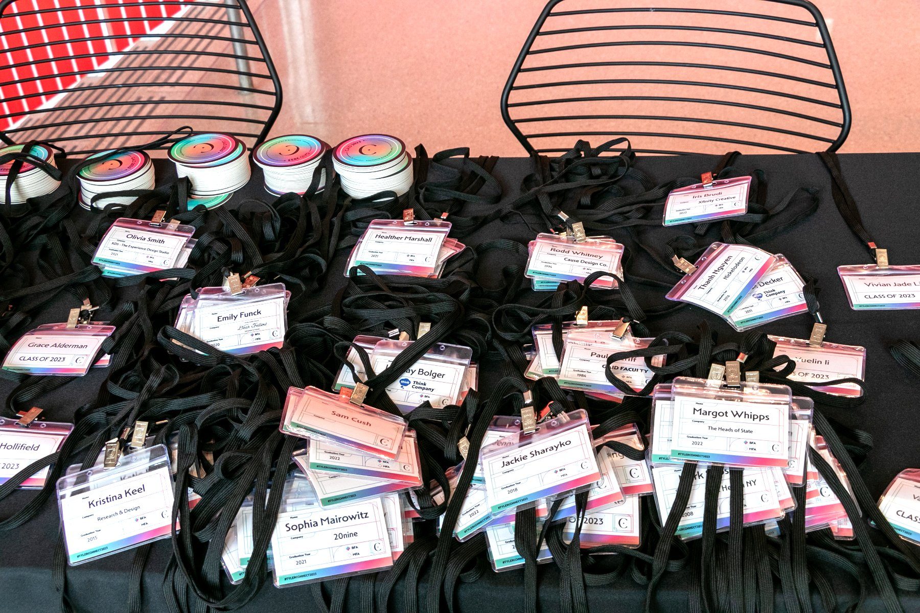
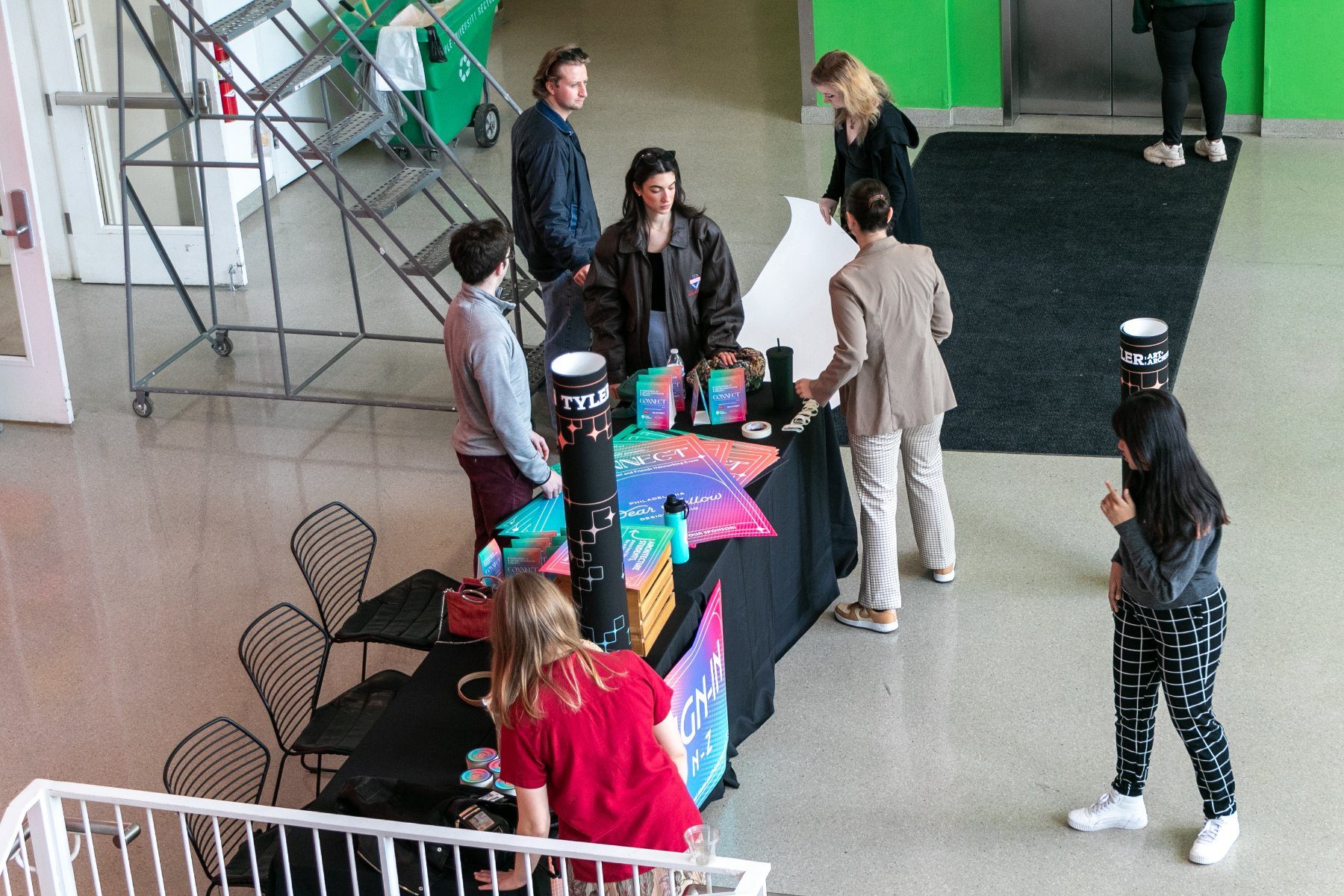
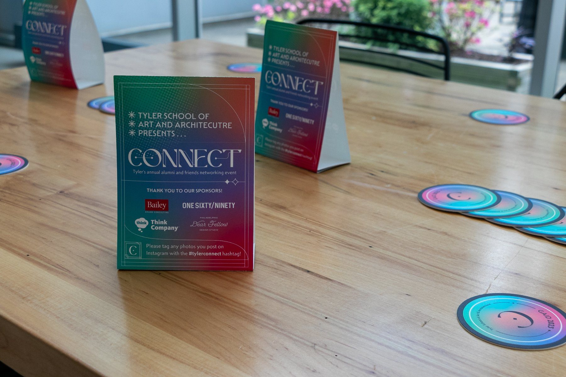
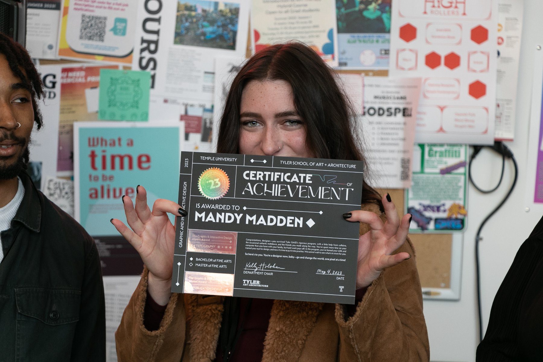
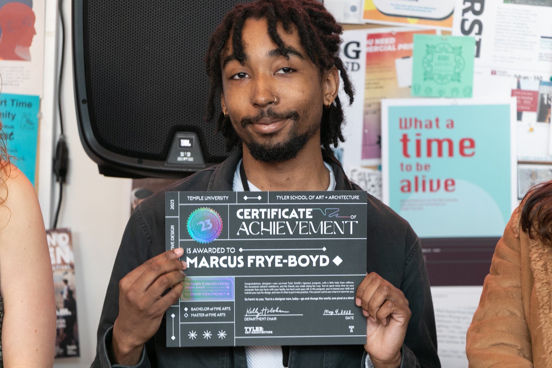
Most of the printed collateral was produced in the school's print studio rather than sent out. Working there as a technician, I handled file formatting and prepress for every deliverable in the system, then ran and finished the pieces we printed ourselves: roughly 250 name tags, the table tents, and the courtyard signage, including welcome and wayfinding panels. Each was printed, trimmed, scored, and assembled by hand in the studio in the days before the event. The certificates, coasters, and holographic seals were produced by outside vendors, where I prepared and checked files against their specifications.
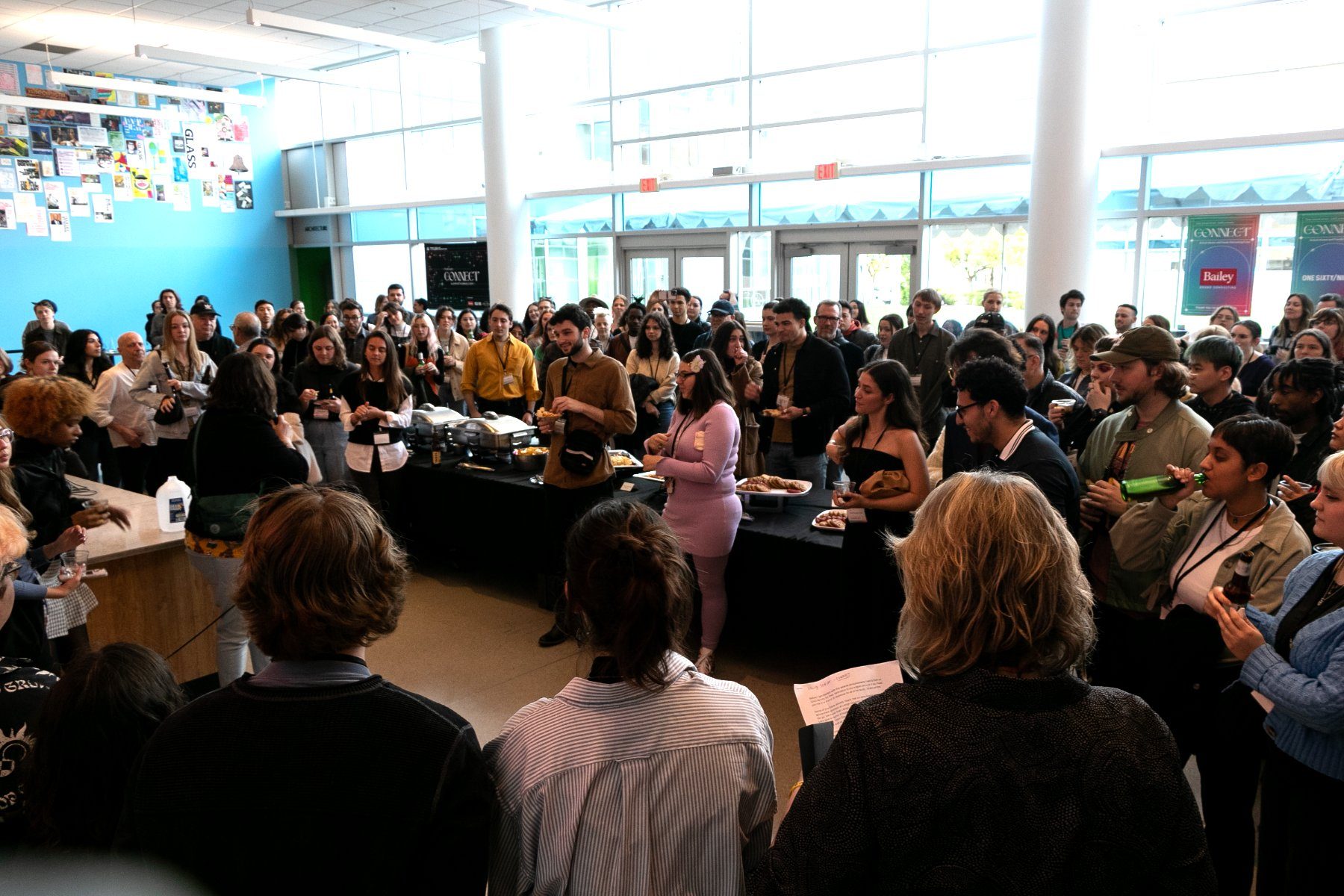
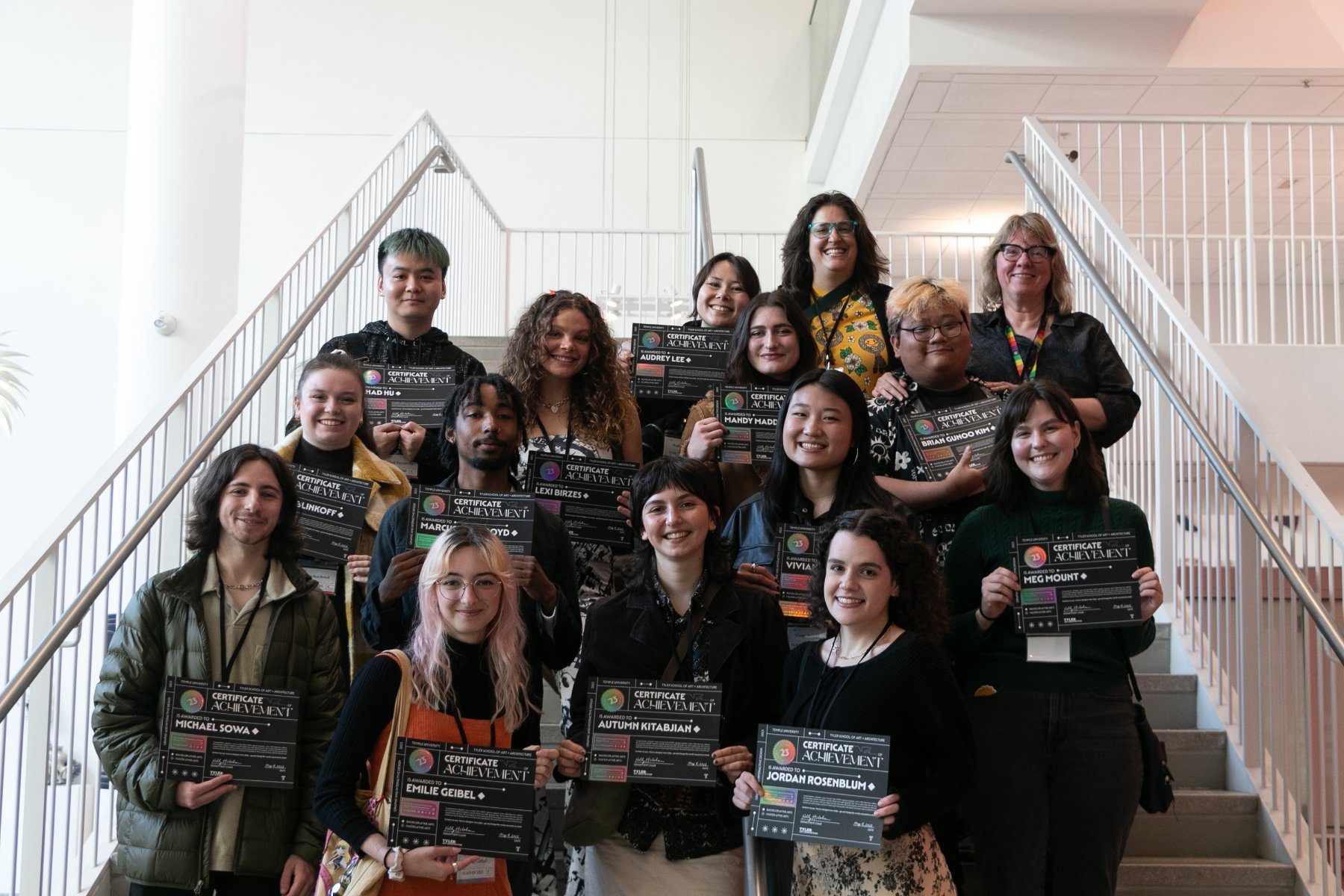
The Event
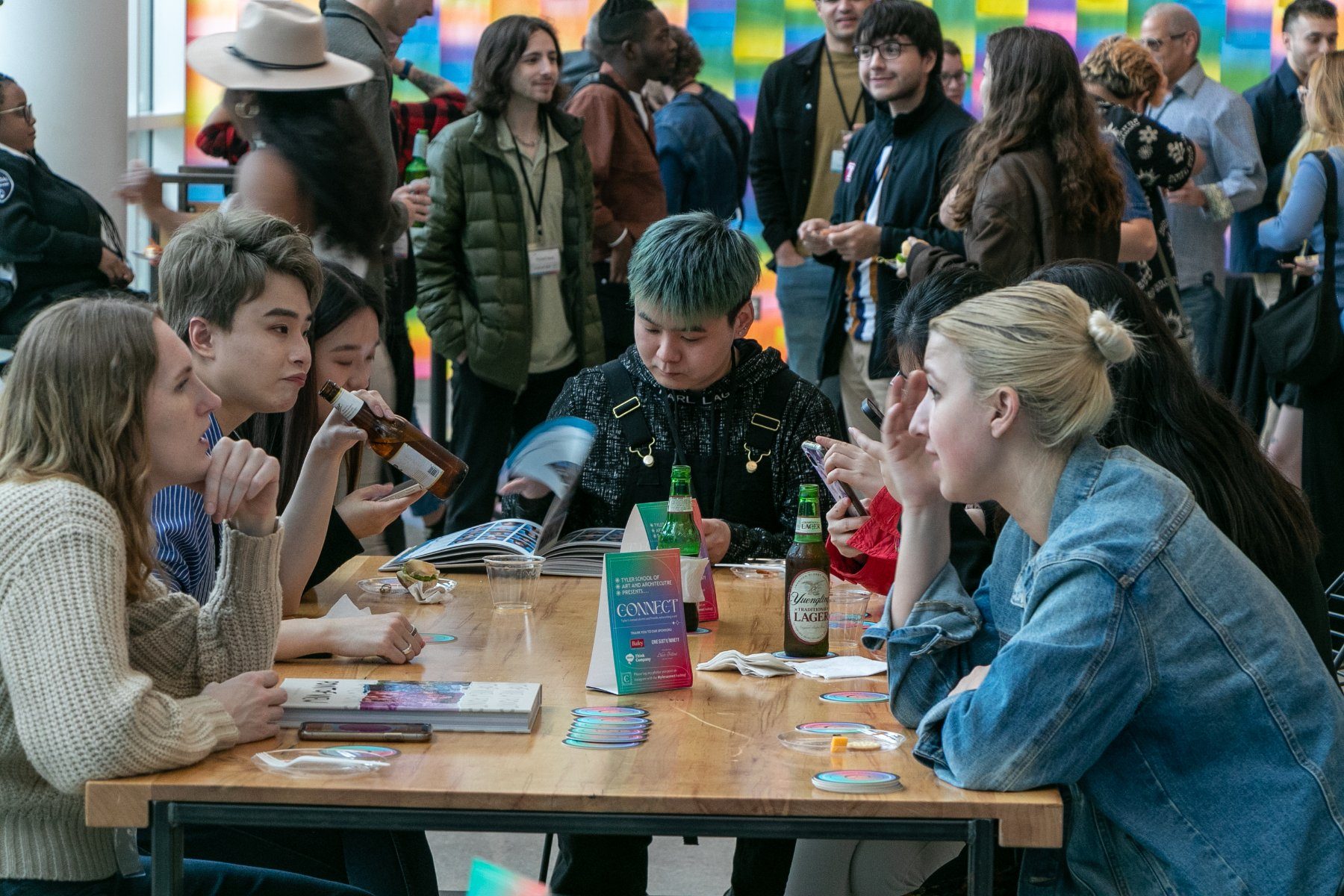
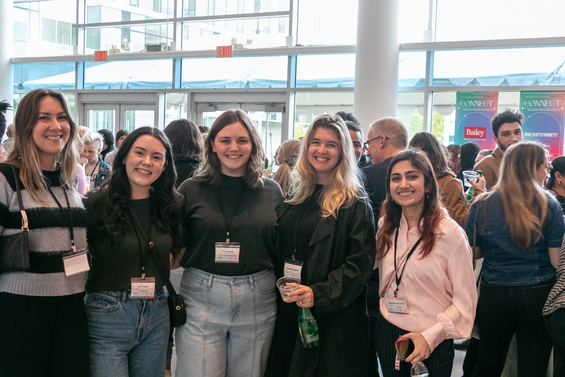
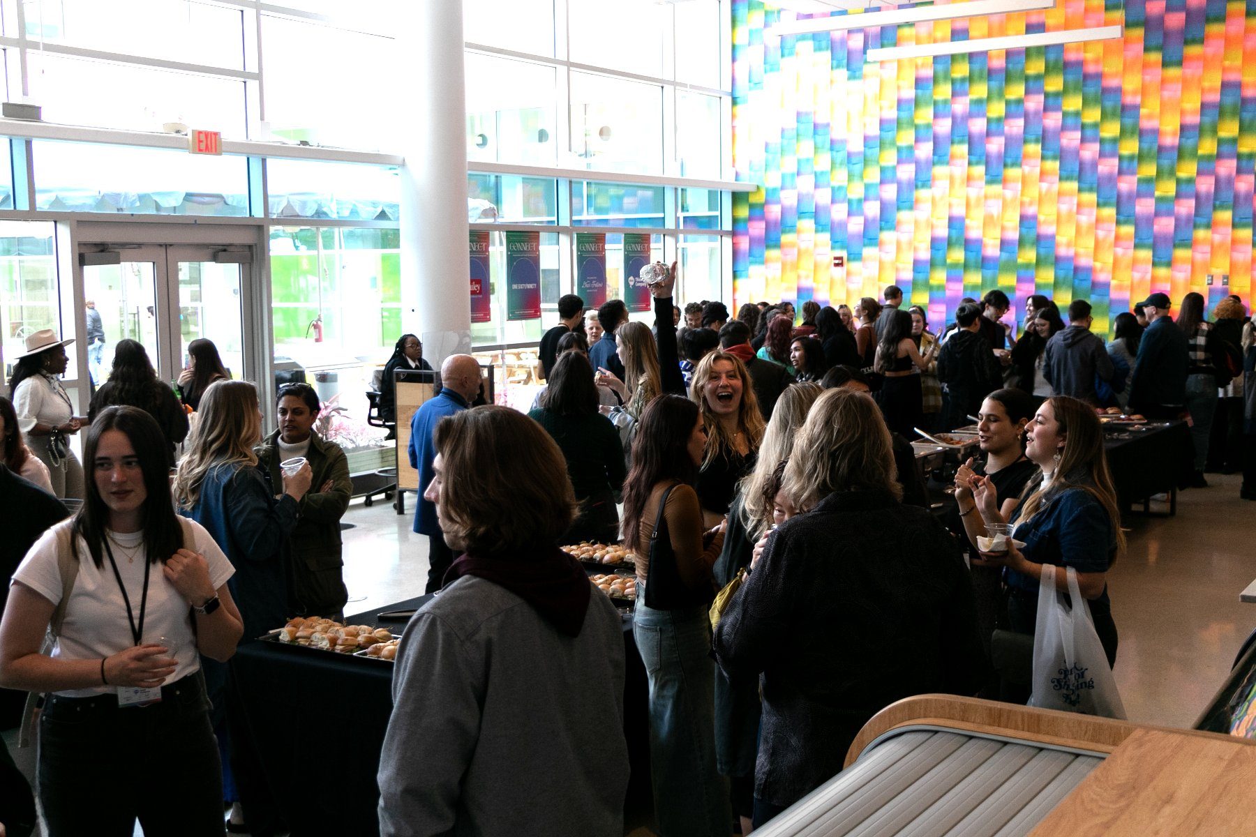
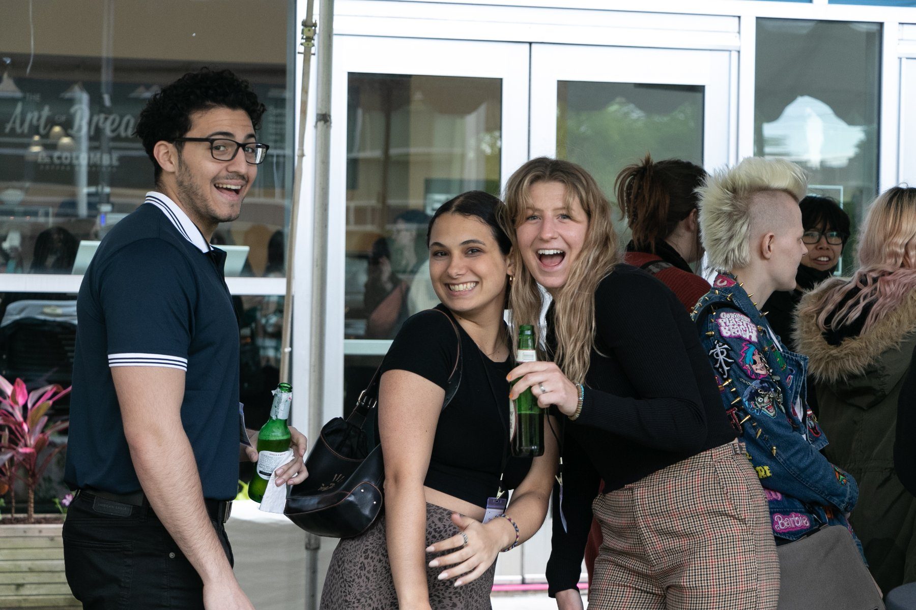
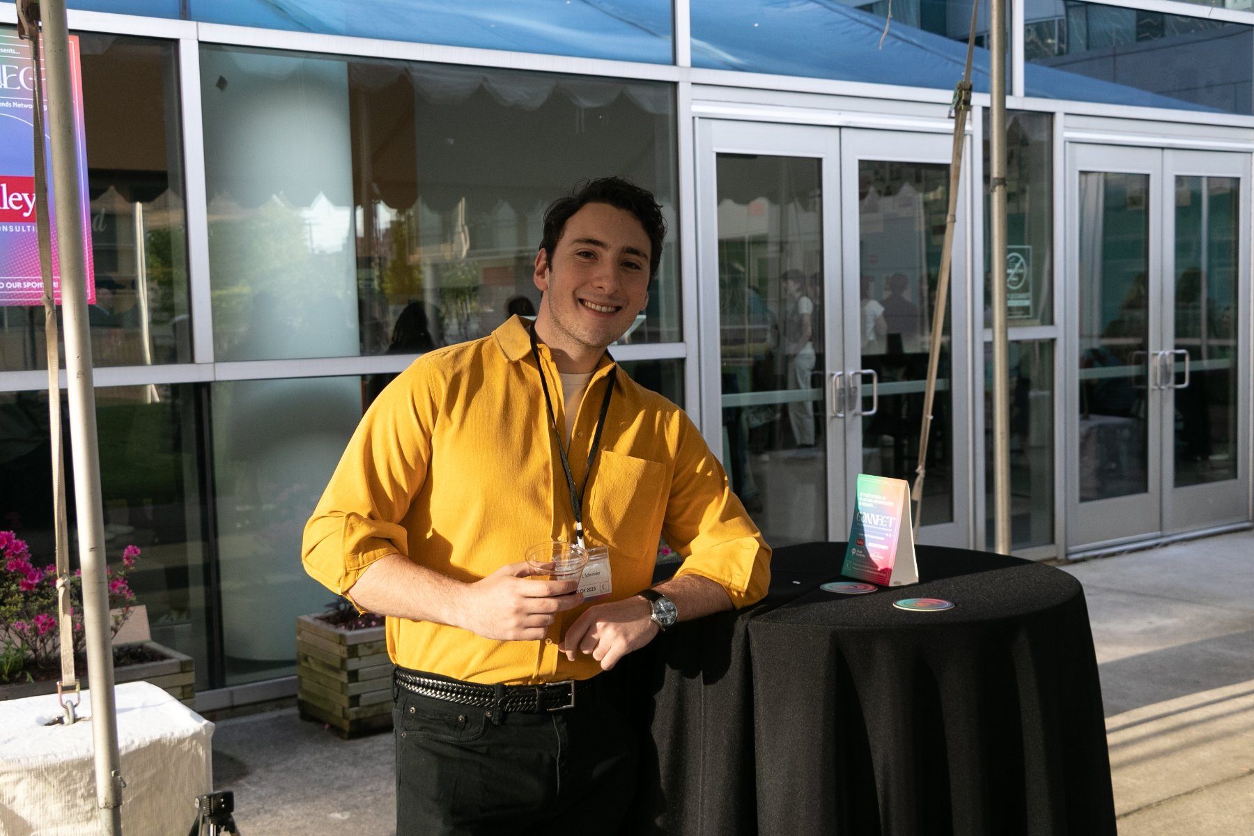
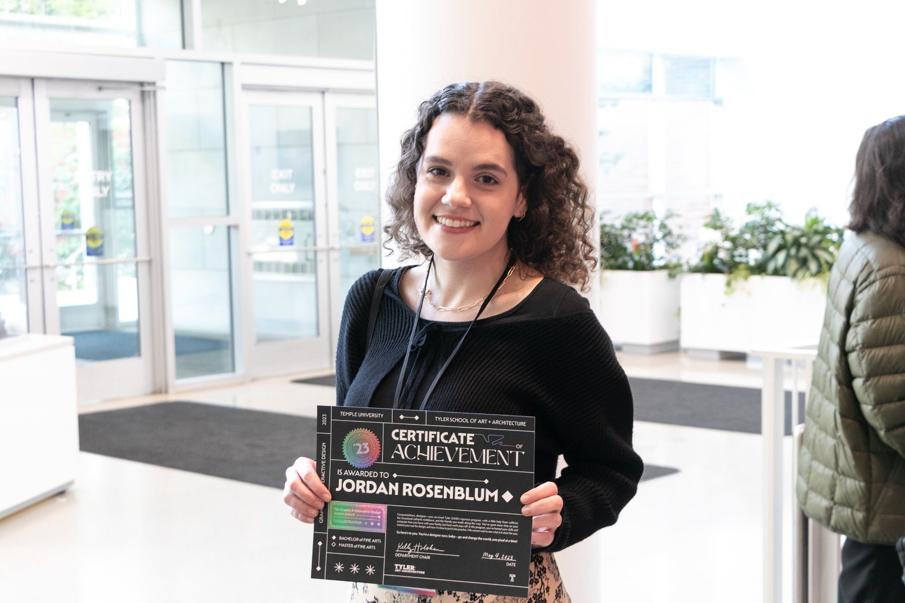
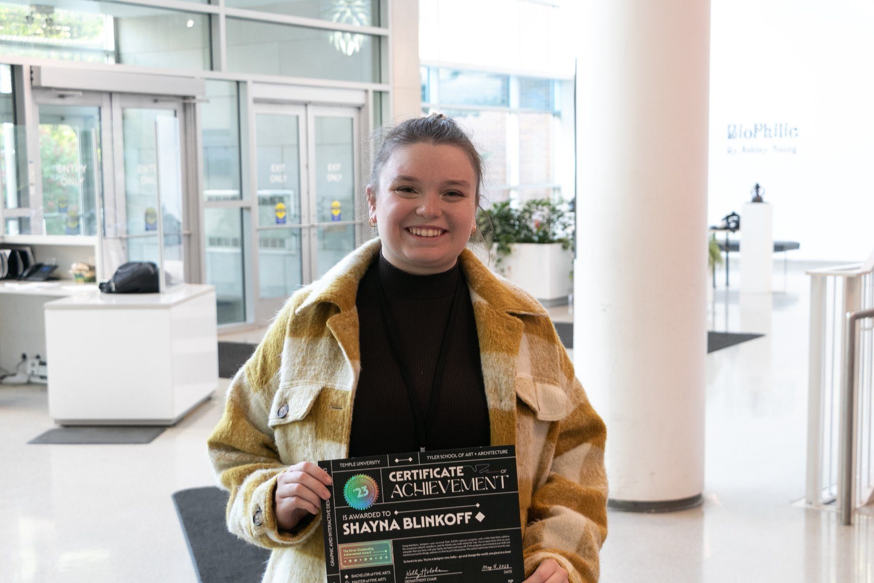
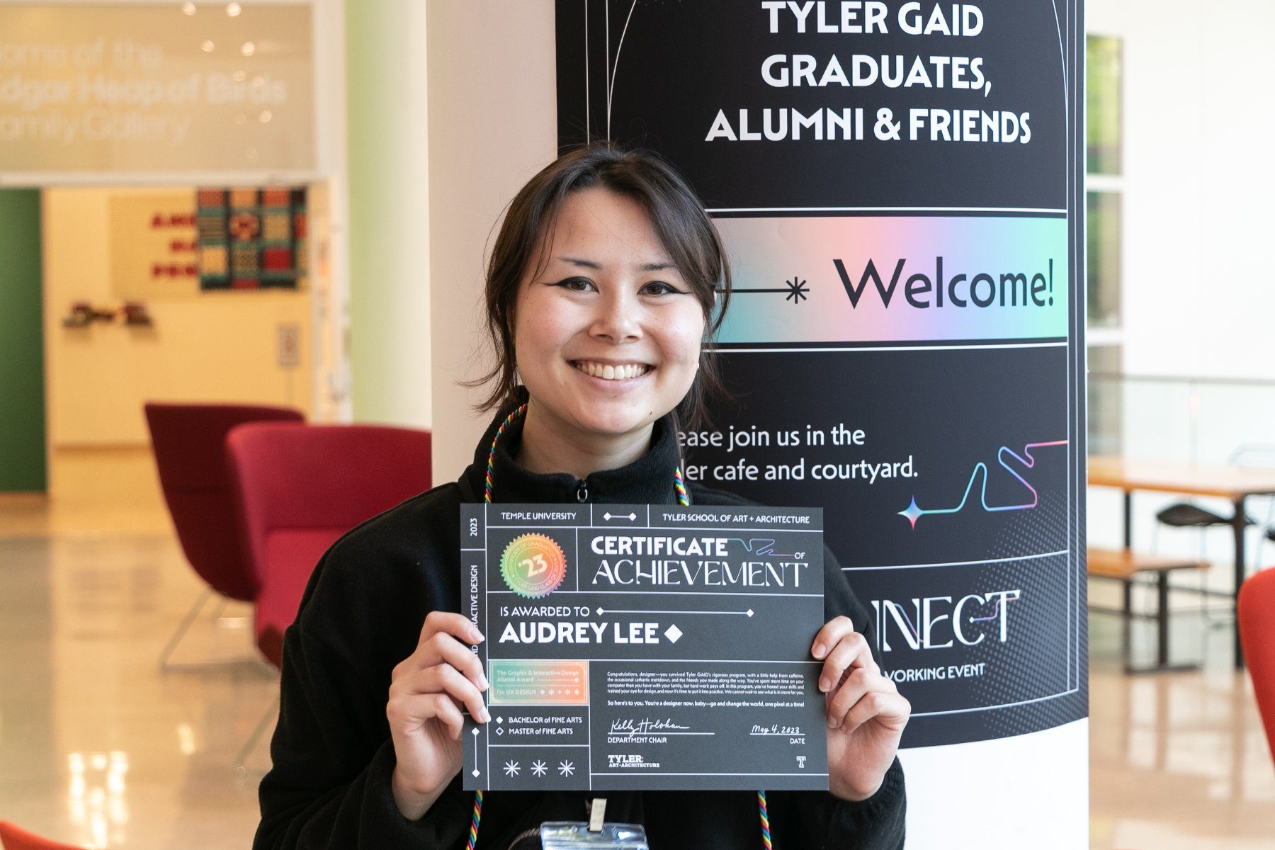
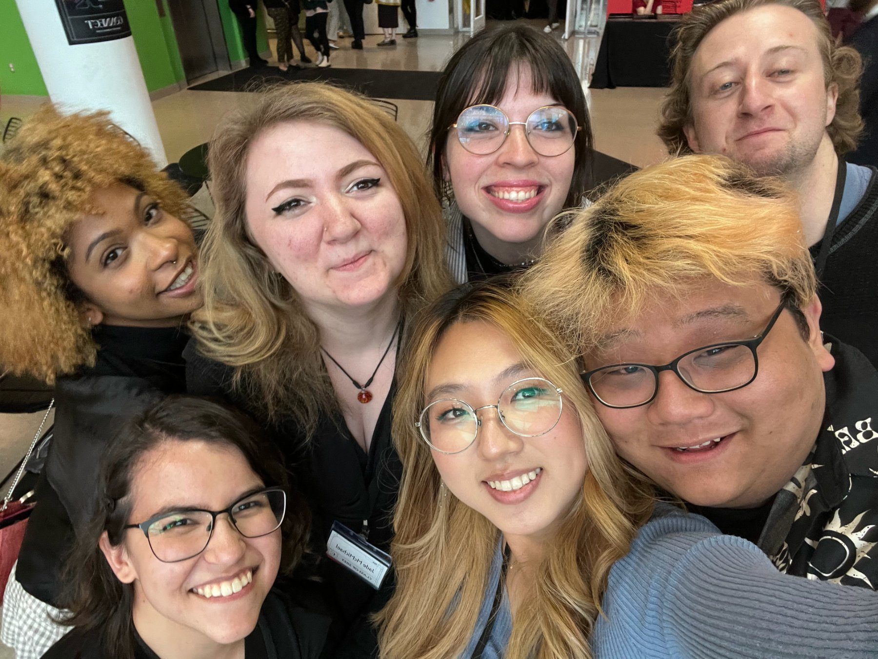
Special thanks to the GAID Class of 2023, our professors, and my beloved underclassmen.